

Ever Heard of a Company Rebranding Before They Even Launched?
Welcome to Naked Fries.
Written by Lauren Grazioso, Co-Founder of Naked Fries. Originally published on The Naked Fries Substack.
As I mentioned in my first post, Naked Fries actually started in August 2023. But with life getting busy, we put it on pause for a bit.
Fast forward to August 2025 - we were ready to build the brand again. Only issue? Our original branding was VERY outdated. Who knew the market could shift that much in a couple of years?
See below for what I am talking about…
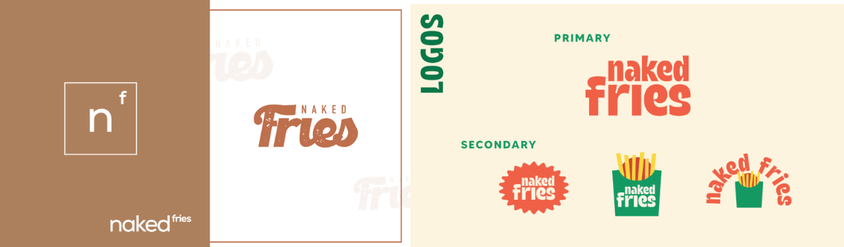
Can you tell the old versus new one? LOL.
Now that we've established how different the original branding was… let's walk through how we built the current one.
Step 0 - Hire a Package Designer
We were referred to our designer by a friend with her own brand. My suggestion is if you like a company’s branding, just ask them who designed it. Simple as that.
Step 1 - Share Initial Thoughts and Packaging Examples
Let’s pull up receipts on what we sent to our designer and by receipts I mean the initial email:
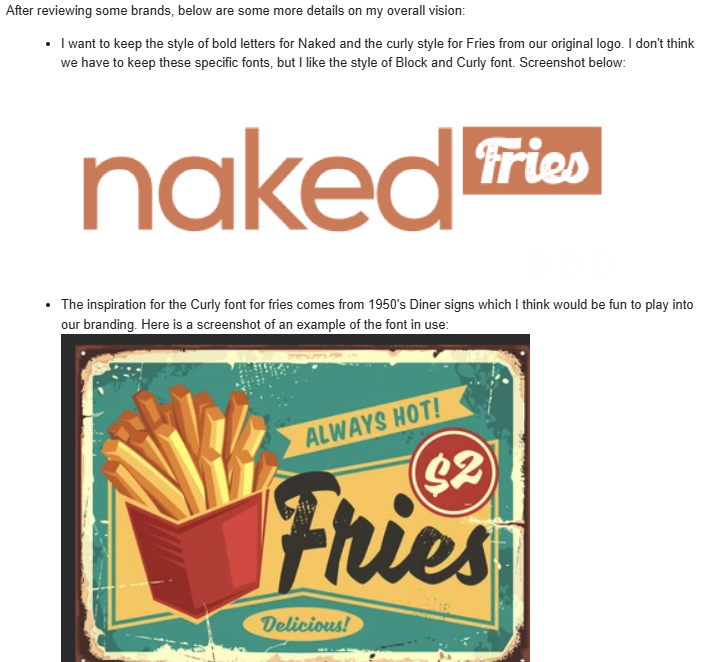

As you can see from our final packaging, we ended up going with different colors, but the font kept the same overall vibe.

Unfortunately, our mascot never made it onto the packaging... but maybe one day we’ll meet him.
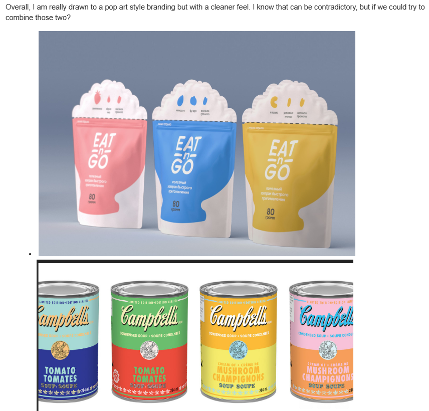
What do you think? Did we pull off the Pop Art x Clean look we were going for?
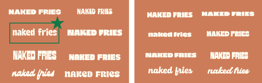
Step 2 - Pick a font
Our designer pulled fonts that aligned with our initial branding and had us select one that stood out for us.
Step 3 - Pick a Color Scheme
We were sent different options for the branding and color schemes. In our designers words, “I started by building a palette around your salmon color, then experimented with making the tones a bit bolder and more vibrant so they’d really stand out on the shelf. From there, I put together a few additional schemes that feel fun and unique.”
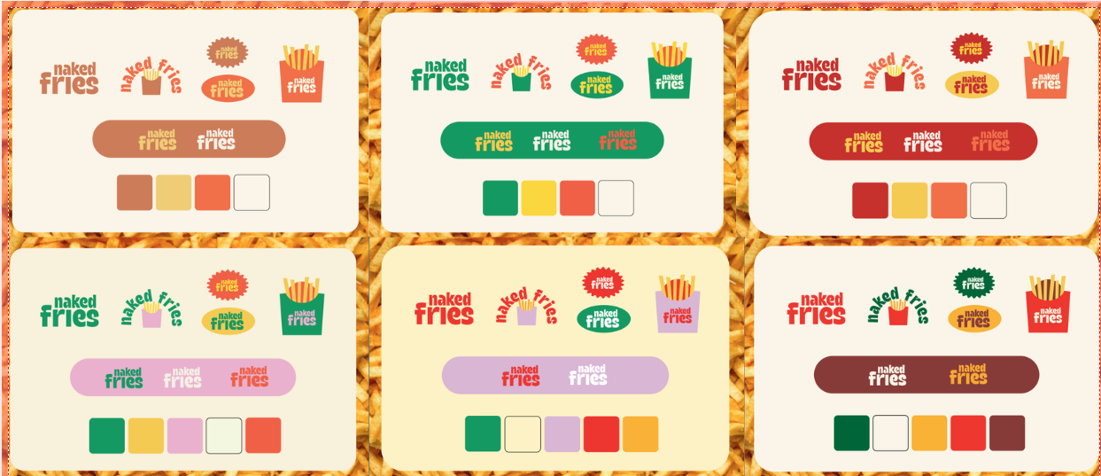
My initial reaction? The green reminded me of relish or pickles. HAHA. Asked if we could try adding a navy or dark turquoise instead...

Well… turns out designers know what they’re talking about - “Personally, I feel like the green ties in with the product better than the blue, it feels fresher and more appetizing, and even gives a bit of that classic diner vibe.”
Option 1 from the second iteration it is!
All the above steps gave us Version 1 -
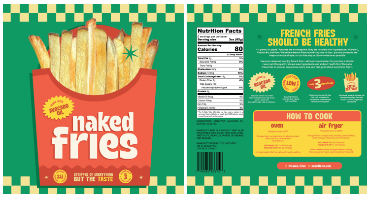
From a design perspective, this was both the first and final version.
BUT as you read in last week’s post on packaging compliance , the design was far from ready for print. There were still plenty of regulatory changes ahead before these bags could hit production.
Want more behind-the-scenes updates? Follow the full Naked Fries journey on Substack .
